Tuesday, 22 February 2011

An analytical review of the work of Jenny Saville.

In this essay i am going to discuss the work of the artist 'Jenny Saville', an english oil painter who's work is very harsh and vulgar, she paints trauma victims, surgery patients, transexuals and transvestites in such an awful but beautiful way. In this essay i am going to discuss Jenny Saville's techniques, materials, processes etc and the effect they have on her audience.


Saville is famous for her paintings of overweight, disfigured ugly or surgery patients. Some of her work is of slaughtered pigs and women pressed awkwardly against glass sheets. Because of the size of the canvas Jenny Saville likes to work on, and the size of the models she paints, the viewer seems to feel like a small child looking up at a huge picture, a huge truthful picture that cannot be escaped from. Jennie Saville seems to enjoy painting the uncomfortable truth and displaying it in a such a large unavoidable way, her audience cannot escape it. Saville doesnt want to hide away the overweight, ugly, disfigured people, she wants them to be admired.


Saville uses oil paint on a huge larger than life size scale canvas. she paints in a way similar to finger painting and she pays very little attention to detail, she doesnt bother about keeping inside the lines or using repetitive brush strokes in one direction, because her work is to put across a message that no one is perfect, so therefore her work of ‘un-perfect’ people should be painted in an ‘un-perfect’ way.


She uses pigmented hues and tones in her work and the way she uses her almost creamy oil paint gives the skin a poured or smeared appearance, making it seem almost impossible to look realistic.


In conclusion, i really like the harsh vulgar work of Jennie Saville, you have to look behind the disgusting far-fetched images, and find the hidden messages behind each individual piece of work she has created in such a beautiful yet ugly way. I have enjoyed looking at Savilles work and i would definitely like to use her techniques and processes in my own work in the future.

Tuesday, 25 January 2011

illustration friday.

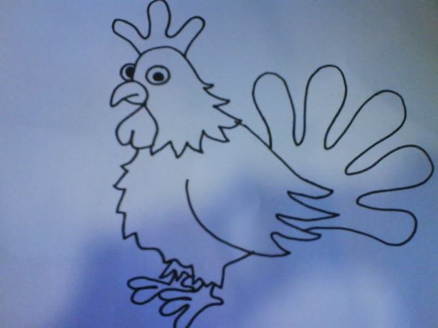
Here is the first image i drew. This image is of better quality because of the simple design.


here is the second image i drew, this is my favourite but due to lack of equipment and time the quality isn't how i would of liked. I then edited the image on photoshop and here is my final result:

Monday, 10 January 2011

Greenwash.

"Greenwash is with us, and unless we take action, it is likely to be with us to stay."


Greenwash is an enviromental issue, found in advertising, PR or on packaging, and made about people, organisations and products. Although greenwash is relatively old it is not very well known. Basically Greenwash is when an enviromentally friendly theory that is over exaggerated or mislead, usually saying products are 'eco-friendly' when they are either the slightest bit 'eco-friendly' it doesn't really make a difference to the environment (like making a recyclable product in a factory that pollutes the sea) or they aren't 'eco-friendly' at all it is just made up.

More recently people are beocming more and more aware of the benefits of being more environmentally friendly encouraging them to buy more 'eco-friendly' products. Because of the increase in sales of 'eco-friendly' products advertisers have become aware that people are becoming more concerned about the environment, and have started making many more 'green' products. But because so many retailers are misusing the term 'eco-friendly' 90% of modern consumers don't trust the information from the government because of good reason.

Monday, 20 December 2010

Leavon Archer - A Freelance Concept Artist.

Leavon is a freelance concept Artist, he mainly works in the gaming areas. He began his career when he was 15 and he got a job creating comics. He got his first job creating games at 17, once he was 18 he decided to go to college to get some qualifications to help him pursue his dream career. He took and Art & Design course at Chesterfield College although he was more interested in Graphic Design he really enjoyed the course. He believes that the life drawing he took part in during his time at college is one of the main reasons he has come so far in his career, he still takes life drawing classes as he believes it is a great help for his character drawings, being able to draw body shapes and in the right proportion.

He started off with very basic characters and was working in 2D. His first gaming job was inspired by the works of Walt Disney. As he progressed and got more and more gaming jobs his character designs improved and he began using different applications such as Photoshop, this gave him the chance to explore working in 3D and he loved it!

He got to work on a Pirates of the Caribbean game for Xbox 360, photographs were taken from the set of the movies to give him a good idea on skin colour textures etc.

He also shows an interest in fantasy art using brush and pen and ink. He looks at anatomy using parts of the human body and muscle structures to get inspiration for creatures and aliens.

He has worked on statues to, and as he has never worked on the design of animals before he decided to create a Russian statue of a horse and its rider. He said that it was great to get a chance to to work on this project because as a character artist you never a chance to use environmental pieces.

He also discussed with us that a lot of people ask him if he ever gets a chance to create his own projects, and he told us that he has a lot of spare time and he uses this to create his own projects, he’s currently working on a project that he is hoping one day will become a film.

Although a lot of the projects he has worked on have fell through he said the experience has been great and having the chance to work on them has been unbelievable. He regrets working on a lot of the projects he has worked on though as he didn’t get the experience he expected.

Sometimes he draws straight into Photoshop using a graphics tablet instead of sketching the images, although sometimes he will sketch an image and then take a photo and upload it to his computer to then edit on Photoshop. He uses various effects on images when editing in Photoshop such as mirroring the image or blurring it etc. Likes to explore new techniques and make his work look more interesting.

When designing characters before he sends them off to the customers he has to have more than one photo, preferably 3 from all angles.

He designs his images in photoshop and then uses an application called Z-Brush to add sculpture to the images. Z-Brush is a sculpting product associated with the Lord of the Rings movies and games.

I found his work really interesting and I liked the fact that he shows a great interest in his work and has a lot of passion. I am not interested in character drawing for a future career but I found a lot of tips he gave us useful.

Recycling Posters.

After Christmas we are going to be starting a new live project, our main task is going to be to create a poster to raise awareness to recycle small electrical goods. I have decided to review some recycling posters to give me an idea of what the client will be looking for, what looks good and what looks bad, and what i would like my final poster to look like. The images i am going to review are some i found on the Internet, i chose to review the images because they caught my attention.


Poster One - Peace Love Recycle.This is a recycling poster that i found on google images. This poster is advertising recycling in general. I like this poster because it has not been put into an organized layout, each image is just placed touching the image next to it, they haven't been layed out as if they were to fit into a grid. Because the poster has been made to represent a different slogan "Peace Love Happiness", it makes it seem more attractive and draws your attention into reading it. I really like the bright colours and the childlike effect of the text, i think this makes it seem more interesting and it doesn't just attract adults it also attracts the younger generations. I think that because it doesn't have a large amount of writing telling you what the poster is aimed at, it makes you more willing to recycle, because when posters have a large amount of text (unless it is a subject you are seriously interested in) you would not want to read it. I would like to make my poster like this as it is very simple but it is very attractive and it represents its outcome clearly.

Poster Two - RECYCLE! Its a plus for the Environment.


I also found this poster on Google images, this is also a poster advertising recycling in general. I like this poster because it seems quite childlike, it could of even been designed by the younger generation. i think it has been aimed at younger people and obviously trying to encourage people of all ages to recycle. It is mainly showing the recycling of paper so maybe this is what it is advertising, maybe it is advertising in pictures rather than words because people tend to be more interested in images. I like the posters layout because it isn't really organized making it seem more simple. I also like that there are images blended into the background showing you how to recycle, but the designer has not made them the main object as it will put people off. I wouldn't use a design like this for my own poster because i think there's a bit to much going on, but i would definitely like my poster to have the same outcome.

Poster Three - you CAN do it! RECYCLE.


This is another poster i found on Google Images I liked this image because it was simple and straight to the point. It is advertising recycling in general and i think that it is really effective. I really like the fact that it has two languages on it, making people who speak in a different language feel more welcome into our country and explaining to them what they should do to help make the world a better place. Although i think the image would look better if the recycling logo was faded out a bit. i think the colours are really bright giving it a happy vibe encouraging people to recycle because it looks fun. When i create my poster i would like it to be like this because the colours are really nice and i like the child like effect it gives.

Poster Four - How many ways can you think of to recycle?

Here is another recycling poster i found on Google Images, this is advertising recycling in general. I like the fact that it is humorous and quite child like. I don't really like the colour combination of the background and the image i think it is to much of a contrast. I really like the fact that the text is small and at the bottom so if your interested you will read further into it to see what it is about, i also like that it is showing you that its the earth your harming by not recycling, i really like the fact that it is straightforward to the point. I would definitely like my poster to look like this because i like the simple cartoon character.

Conclusion:

I have learnt a lot from looking at these posters, it has given me a variety of ideas of what i could use in my poster and what i shouldn't put in my poster. I already had numerous ideas of what i would like my poster to look like, but after looking at the other posters it has given me a more precise idea of what i would like my final outcome to look like.